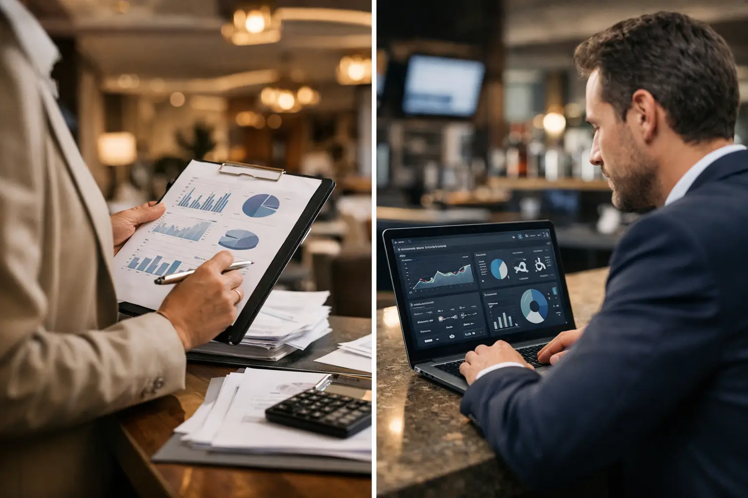
A breakfast outlet misses its upselling target, a restaurant has incomplete allergen sign-offs, and a front office team is short on a critical procedure. By the time these issues appear in a weekly spreadsheet, the revenue opportunity, compliance exposure, and guest experience damage may already be real. That is the practical difference in manual reporting versus operational dashboards: one records what happened; the other helps leaders see what requires attention while there is still time to act.
For hospitality groups managing multiple properties, outlets, menus, shifts, and languages, reporting is not an administrative exercise. It is the daily nervous system of operational leadership. The question is not whether managers need reports. They do. The question is whether those reports create timely, reliable action or simply document yesterday's performance.
Manual Reporting Versus Operational Dashboards: The Core Difference
Manual reporting usually depends on managers collecting updates from departments, exporting data, checking files, chasing missing information, and assembling a daily, weekly, or monthly view. The output may be a spreadsheet, email summary, slide deck, or shared document. It can be useful, especially for financial reviews, ownership reporting, incident records, and irregular deep analysis.
Its weakness is the operating rhythm. Manual reports are often retrospective, labor-intensive, and vulnerable to inconsistent inputs. A restaurant manager may interpret a service issue differently from a hotel outlet manager. One property may submit its report at 9 a.m.; another may submit it after a leadership call. By the time a regional operator compares performance, the morning shift is over and the next service is already forming its own risks.
An operational dashboard is designed for a different job. It brings selected operational measures into a current, shared view so managers can identify exceptions, patterns, and priorities without rebuilding the picture from scratch. It should not attempt to display every number available. A useful dashboard shows the few indicators that tell a leader where standards, revenue, safety, knowledge, or execution need intervention.
This is where Hospitality Operational Intelligence becomes more valuable than a collection of disconnected reports. OI connects the signal to the operating context: which team needs support, which standard is weak, what knowledge gap is recurring, and what managers should address in the next briefing.
The Hidden Cost of Reporting by Hand
The most visible cost of manual reporting is management time. Consider a group with 12 outlets where each manager spends 15 minutes compiling a daily update and a senior leader spends another hour consolidating it. That is four hours of leadership capacity consumed each day before anyone has diagnosed a problem or coached a team.
The larger cost is decision delay. A report can show that menu knowledge scores declined last week, but it may not reveal whether the issue is isolated to new hires, a newly launched menu, one outlet, or a specific daypart. Without that context, leaders default to broad reminders and repeat training. The real issue remains in place, while upselling performance and guest confidence suffer.
Manual workflows also create version-control problems. A general manager may be working from one file while the food and beverage director has a revised version. A quality manager may have a separate audit tracker. A training lead may hold completion data elsewhere. Each document can be accurate on its own and still fail to give the business a coherent operational picture.
This fragmentation is particularly expensive in high-standard environments. Luxury properties, resorts, cruise operations, and multi-outlet restaurant groups cannot rely on occasional visibility when allergen safety, brand procedures, service recovery, and guest preferences need consistent execution every shift.
Where Manual Reports Still Belong
Replacing every report with a dashboard is not the goal. Manual reporting remains appropriate when a leader needs interpretation, narrative, or a formal record. Monthly owner packs, annual budget reviews, major incident investigations, post-opening assessments, and strategic performance reviews require judgment that cannot be reduced to a single screen.
A strong operating model uses dashboards for daily management and manual reports for deeper analysis. The dashboard identifies that a problem exists and where it is concentrated. The report explains the business implications, documents findings, and supports larger decisions.
For example, a dashboard may show that pre-shift briefings are not consistently completed across three dinner outlets. The operations director can address the exception immediately. A later report can examine whether missed briefings correlate with lower check averages, guest complaints, slower service, or audit findings over a full reporting period.
The trade-off is simple: dashboards prioritize speed and focus; manual reports prioritize detail and explanation. Mature operators need both, but they should not use a weekly reporting process to manage a same-day operating risk.
What an Operational Dashboard Should Show
The best operational dashboards are built around decisions, not data availability. If a measure does not change what a manager does during the shift, week, or month, it may belong in a background report rather than the primary view.
For hospitality operations, the most valuable areas typically include service standards, knowledge readiness, compliance exposure, revenue behaviors, and management follow-through. A hotel leader may need visibility into onboarding progress, open operational questions, SOP acknowledgment, briefing completion, recurring guest-service issues, and audit readiness. A restaurant group may focus on menu knowledge, allergen procedures, upselling behaviors, outlet-level execution, and manager response times.
The measures should also be actionable. “Training completion at 82%” is a weak signal if it does not identify the affected roles, locations, or required next step. “Eight new servers in two outlets have not completed the current allergen knowledge check before Friday dinner service” gives a manager a clear intervention point.
That level of clarity is the difference between reporting activity and managing performance. It allows leaders to direct coaching where it matters rather than adding another generic message to a staff group chat.
The dashboard must reflect the service floor
A polished dashboard is not automatically useful. If it is designed only around corporate metrics, outlet managers will see it as another head-office request. The daily view must reflect real operating conditions: a new banquet team starting tomorrow, an updated allergen matrix, a recurring question about wine pairings, a weak handover, or a property preparing for an audit.
Operational Intelligence works when information flows both ways. Leadership gains visibility across the portfolio, while teams receive OI Briefings, OI Knowledge, and OI Recommendations that make the next action clearer. Managers remain accountable for judgment and coaching. The platform gives them a more reliable basis for both.
From Visibility to Operational Action
Dashboards fail when they become passive screens. A regional director can see a red indicator for several days and still achieve nothing if no operating cadence follows it. The dashboard needs an owner, a threshold, and an expected response.
A practical rhythm might include a pre-shift review of urgent service, safety, and staffing knowledge gaps; a daily manager review of outlet exceptions; and a weekly leadership review of recurring patterns. This creates a direct line from signal to action. A low menu-knowledge result can trigger a targeted briefing before service. Repeated missed SOP acknowledgments can trigger manager follow-up. An audit-readiness gap can be resolved before an inspection becomes a costly scramble.
This is also where operational reporting becomes commercially relevant. Revenue leakage is rarely caused by one dramatic failure. It accumulates through small misses: a server unable to describe a premium item, inconsistent suggestion selling, a team member unfamiliar with a current promotion, or a manager too busy to spot patterns across shifts. A well-designed dashboard makes those small misses visible before they become normalized.
SmartHospitality.AI approaches this as Hospitality Operational Intelligence, connecting operational knowledge, onboarding, briefings, reporting, and decision support in one operating layer. The objective is not to give leaders another screen to monitor. It is to reduce the gap between knowing there is a problem and giving the right team the right operational direction.
How to Make the Shift Without Creating More Work
The shift from manual reporting to dashboards should start with one operational question: what must leadership know early enough to change the outcome? Avoid beginning with every available field in existing spreadsheets. That approach recreates reporting clutter in a new format.
Choose a limited number of indicators tied to high-stakes outcomes. For many operators, that means allergen readiness, SOP compliance, onboarding status, briefing completion, knowledge confidence, upselling execution, open audit actions, and repeated manager questions. Define what each measure means, who owns it, and what action follows when it moves outside an acceptable range.
Then retain the reports that serve governance and analysis. Do not force a dashboard to carry detailed commentary it was never designed to hold. The goal is a cleaner operating system: immediate visibility for daily decisions, structured reports for leadership reviews, and shared definitions across every property and outlet.
The strongest hospitality organizations do not wait for a monthly pack to tell them whether standards are holding. They create an operating rhythm in which managers can see the next risk, brief the right team, and protect the guest experience before the next service begins.